Overview
The resorts website acts as a portal for customers to explore and browse all the available resorts options within our client’s brand, with links that directs customers to each individual resort’s website or the brand’s booking website.
Project Goals
- Enhance the retailing (converting ‘lookers’ to ‘bookers’) and navigation functionality of the landing page.
- Make the path to purchase easier for the customer.
- Utilize imagery to highlight main content and high-priority information.
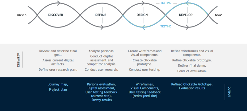
Process & Plan
Our approach, activities, and outputs for each phase.
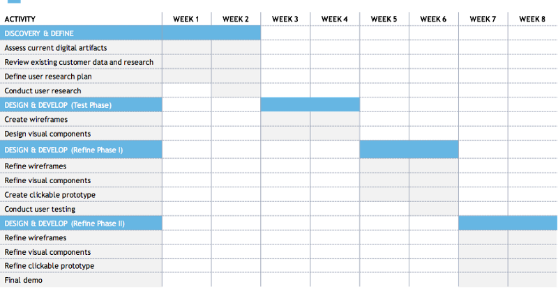
Our project timeline over a course of 8 weeks.
Discover & Define
Persona
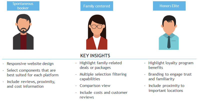
Based on the personas provided by our client, we focused on the 3 with the most potential to be engaged in the “Dreaming” stage.
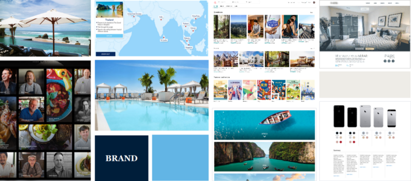
Digital Assessment
For a better understanding of the current landscape, we assessed our client and competitor’s websites based on structure, customer-centric design, branding, and modern aesthetics.
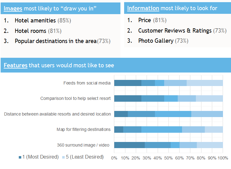
Survey
From the 26 responses we received, we drew insights to help us prioritize the content and features to be shown on our website.
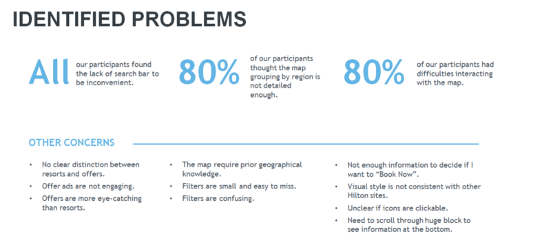
Current Site Testing
We conducted 5 testing sessions to identify problems in usability and functionality of the current website.
Design & Develop
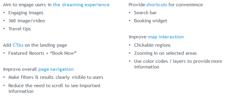
Design Strategy
Using PET (Persuasion, Emotion, Trust) design and insights from our findings, we prioritized the content and components to be included in our wireframes.
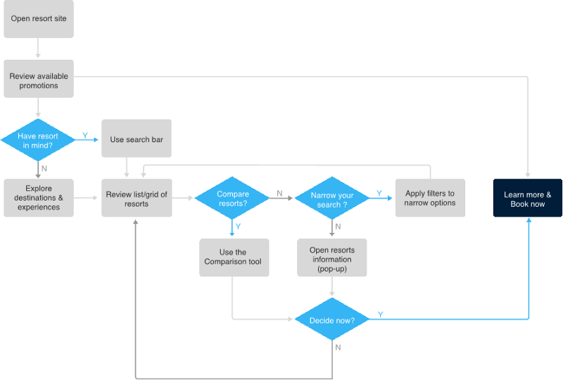
User Flow
We studied the current user flow of the website and analyzed how this flow could be improved.
Our ultimate goal is for the user is to either:
- “Learn More” to be redirected to the individual resort’s website.
- “Book Now” to be redirected to the resorts booking portal.
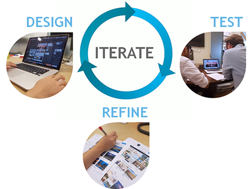
Iteration Process: Design, Test, Refine
In each iteration, we created the design, conducted user tests, and consulted with experts from the UX team, Creative team, and Strategy team. We then refined our deliverables according to the feedback we received.
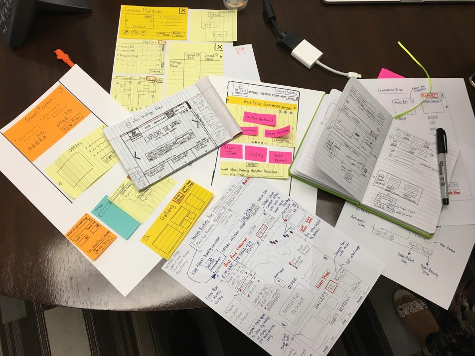
Sketches
We created initial hand-drawn sketches for ideation based off insights from our user research and strategy.
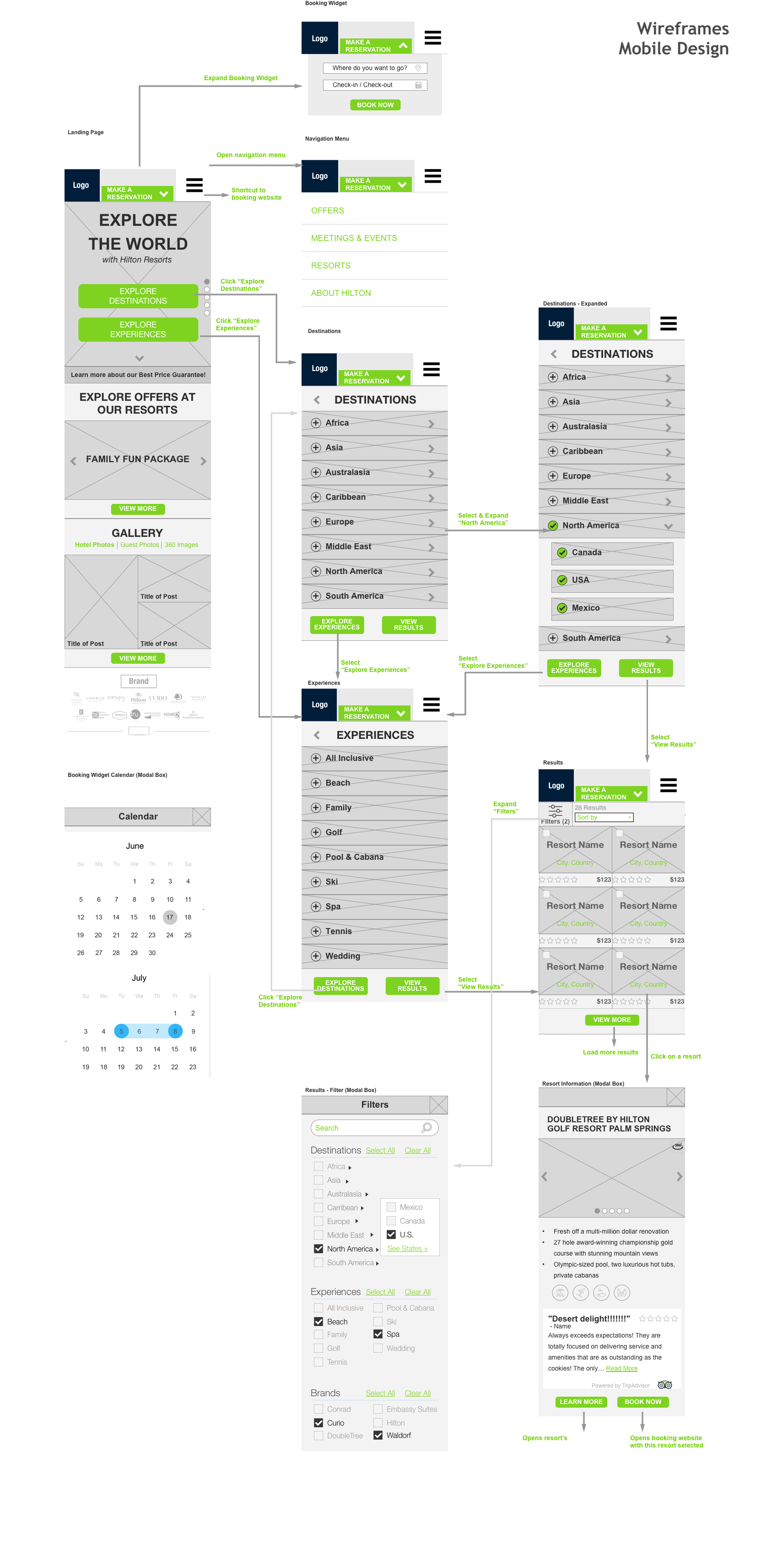
Wireframes
We created low-fidelity mock-ups using Sketch to show the placement of each component and the flow from screen to screen.
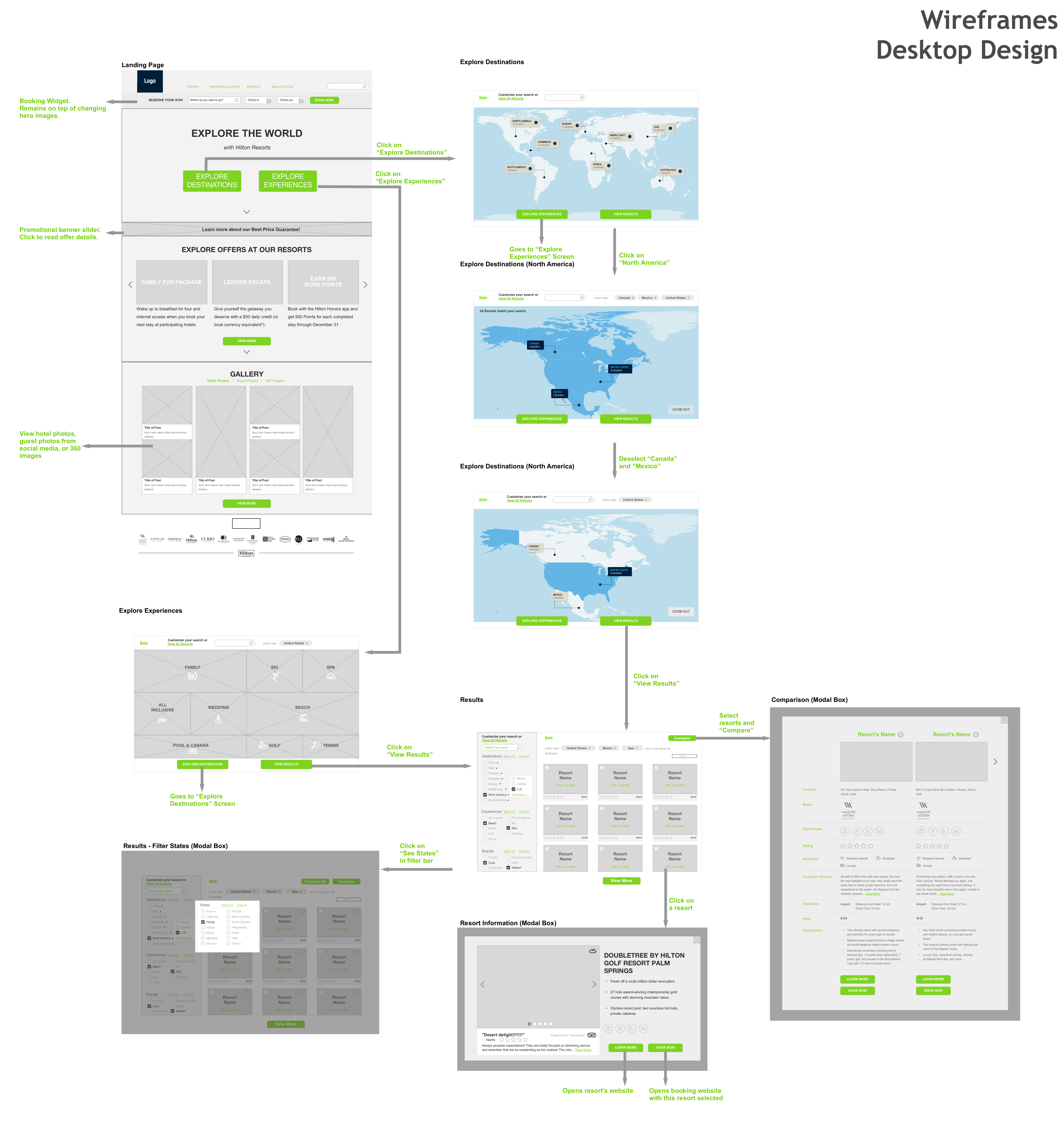
Throughout the testing and iterations, we made design changes as below:
- Utilize a list instead of a map on the mobile version. This allows for easy selection while providing a comprehensive list of destinations. The map requires large screen space and complicates that interaction.
- Remove the comparison feature from the mobile version. The majority of our participants said they would not use this feature on mobile because they are merely "browsing through the options". They would refer to the desktop for more important, detailed decisions.
- Select "US" as a whole, then allow users to refine the selection later after seeing the results. Because the US is the only country with third-level filter to narrow down the states, we decided to keep the initial level of selection consistent.
Visual Components
After having our wireframes, we created individual components based on our client’s branding, icons, and style guide using Photoshop.
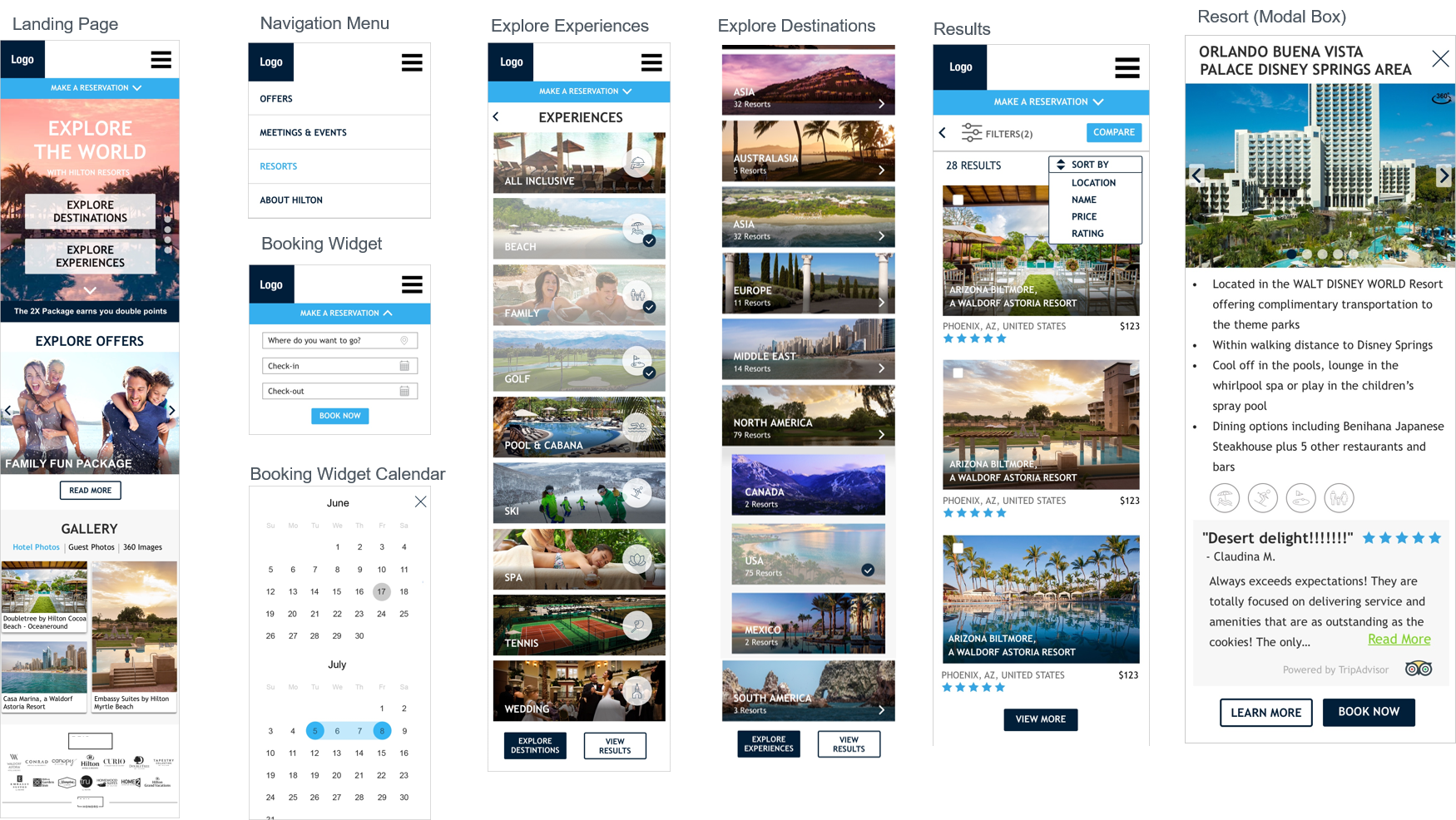
Prototype
We created clickable prototypes with screen transitions using Invision.
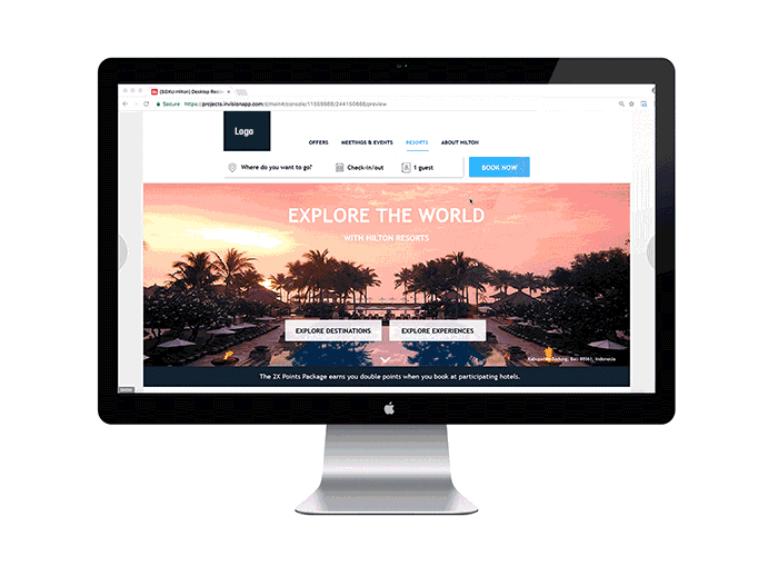
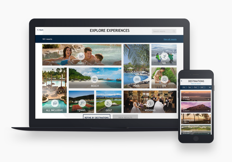
Desktop prototype showing components on the home page.
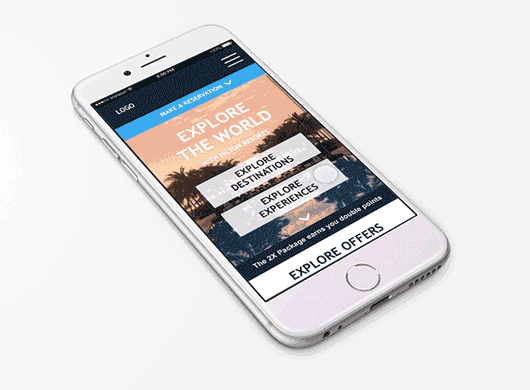
Mobile prototype showing how to narrow down hotel options.
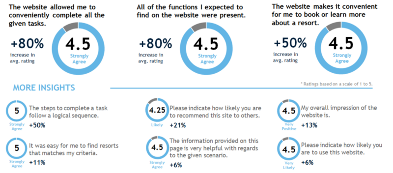
Evaluation
After creating the finalized version of our prototype, we conducted user tests on both the current and new designs to benchmark several usability ratings. The most significant increases in the ratings demonstrates an enhanced usability of the website. However, as a trade-off for this enhanced usability, we reduced the size of image cards to make space for more information and features in our redesign. Hence, several participants prefer the visual aesthetics of the current website and find them more emotionally inviting for exploration.
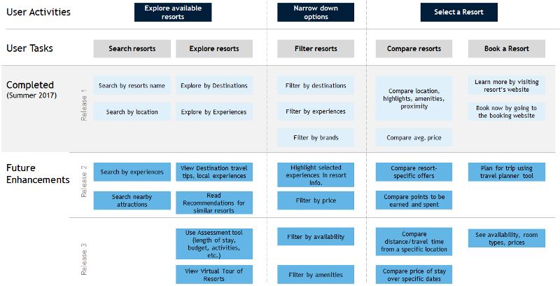
Looking Forward
To conclude our redesign project, we proposed a long term Road Map for further enhancements of the website— including several features that could be included to better support the user tasks.
Reflection
Over the course of 8 weeks, I was able to grow both personally and professionally as a UX Designer. Also, I could definitely say this is one of the best team dynamics I’ve ever worked with. I am very thankful to have such great team members and mentors who would go beyond their assigned roles, as well as clients who were very understanding and easy to communicate with.
1. Test early, test often!
Quick, informal test sessions can reveal a lot about your designs, as well as any wrong assumptions you may have!
2. Overwhelmed with feedback? Step back to look at the bigger picture.
What was the main goal of your project? What are the trade-offs that would need to be made in order to achieve that goal?
3. For responsive websites, remember that the user goals for each device may be different.
In our case, the users did not require the comparison feature on mobile because it contains too much detail. If they are really interested in comparing the options, they would've referred to the desktop site.