Overview
Flipboard is an app that aggregates content from social media, news feeds, and other websites and presents it in magazine format, allowing users to "flip" through the articles being shared.
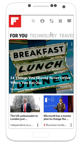
Last year in February, Flipboard released a major redesign aimed towards personalization — What’s your passion?. This new Smart Magazine feature gives users more specific control over the topics they read by selecting specific tags to create their own customized magazines.
However, without careful use, this new feature may create a new hassle — a cluttered home screen with a lack of organization.
Now that I can create my own magazines, is there a way for me to organize them on a rack?
In this project, I propose a solution to take the personalization and customization a step further.
Analyzing the Problem
Taking a closer look at the current app, I identified the issues that prevents users from having a fully personalized home screen.
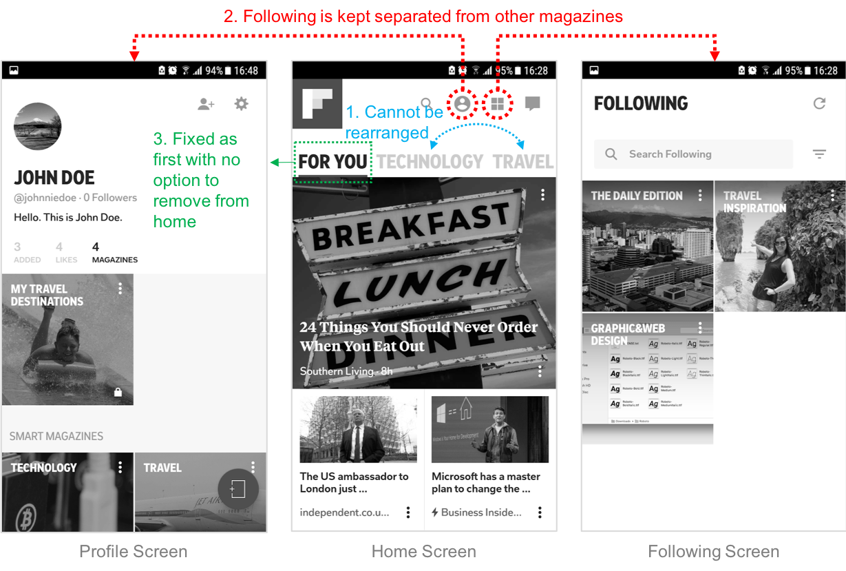
Issue 1: While the app allows you to add or remove magazines from the home screen, there is no way to arrange the order of the magazines to be shown. The order is based on when the magazine is added.
Issue 2: Following and Smart Magazines are kept separately. There is also no way to access the Following from the profile page, making it difficult to find.
Issue 3: For You feed is fixed as the first magazine, with no option to be removed from home. Hence, the AI generated personalized content would always be prioritized over the user’s own customized magazines.
Ideation & Design
To frame my ideation, I defined 3 main tasks that the solution needs to support:
- Adding a new magazine to home
- Re-ordering the magazines on home
- Removing a magazine from home.
After sketching out a few ideas, I narrowed them down to the 2 with the biggest potential.
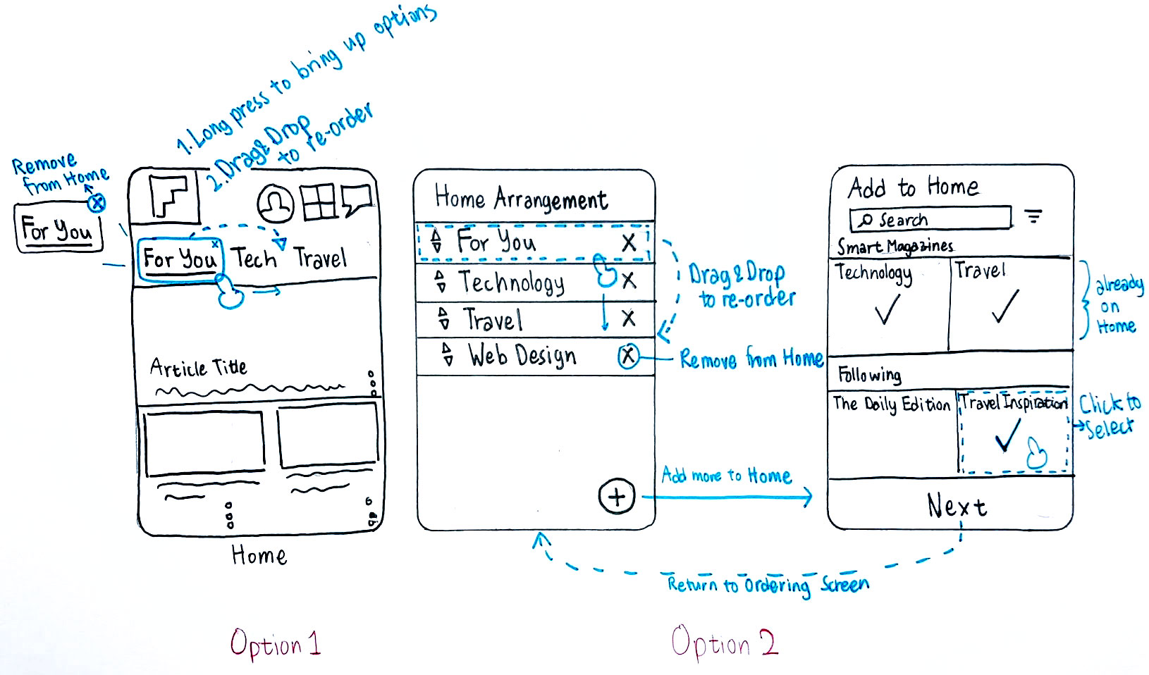
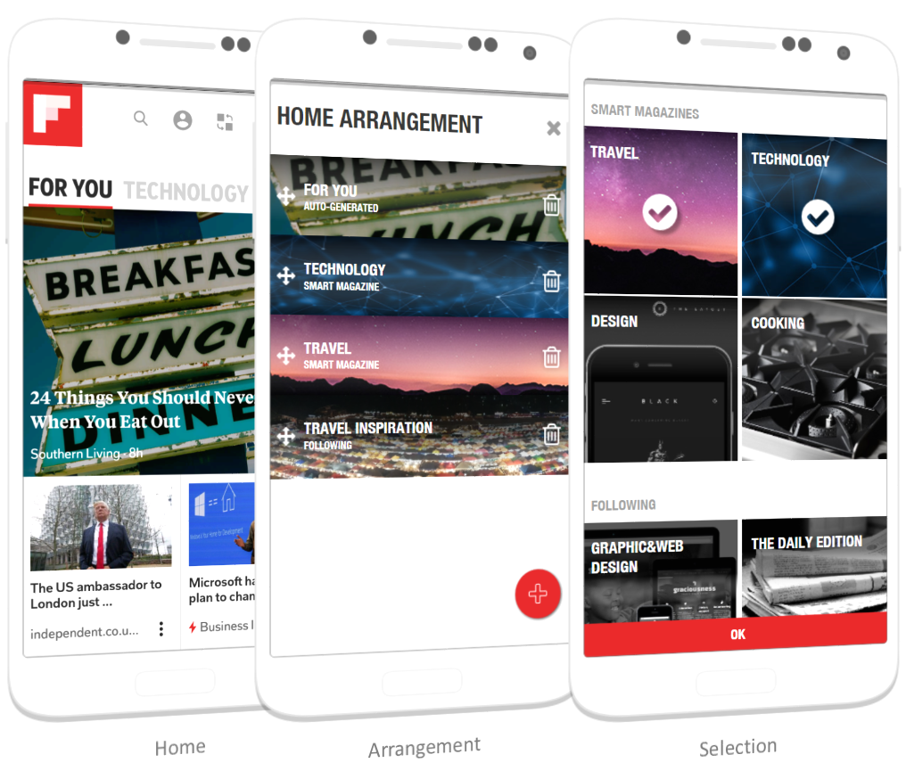
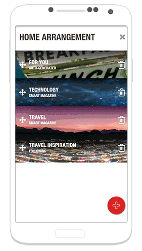
Option 1: Re-ordering directly on the Home screen
This is a convenient solution that does not require any additional screens. However, the feature is not easily discover-able and horizontal drag & drop may be very difficult to use if there are many magazines on Home.Option 2: Having a new Arrangement screen
This option allows users to see a comprehensive list of magazines currently shown on Home, giving the big picture. The vertical list allows more flexibility and ease of use in moving the magazines around.I decided to go with the second option due to it better discover-ability and availability of vertical space to accommodate more magazines.
Prototyping
I selected Axure as my prototyping tool because it allows me to simulate a drag & drop interaction — an essential part of my design. After finishing the prototype, I tested it out with my friends and colleagues using this script:
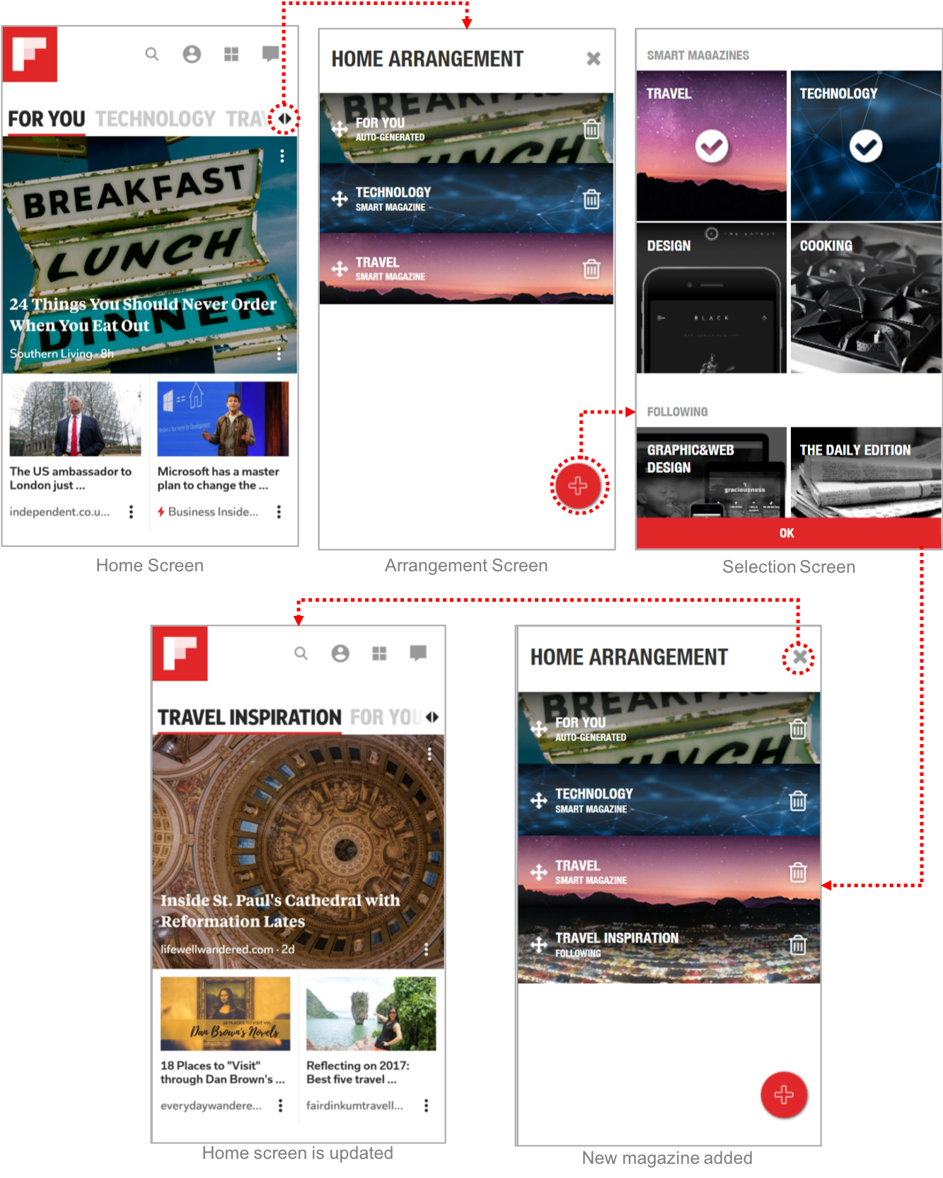
You want to re-orgranize the magazines on your home screen.
- Open the re-arrangement screen.
- Add a new magazine called “Travel Inspirations” from your list of Following.
- Remove “Travel” from the list.
- Move “Travel Inspirations” to the first magazine.
- Return to the home screen.
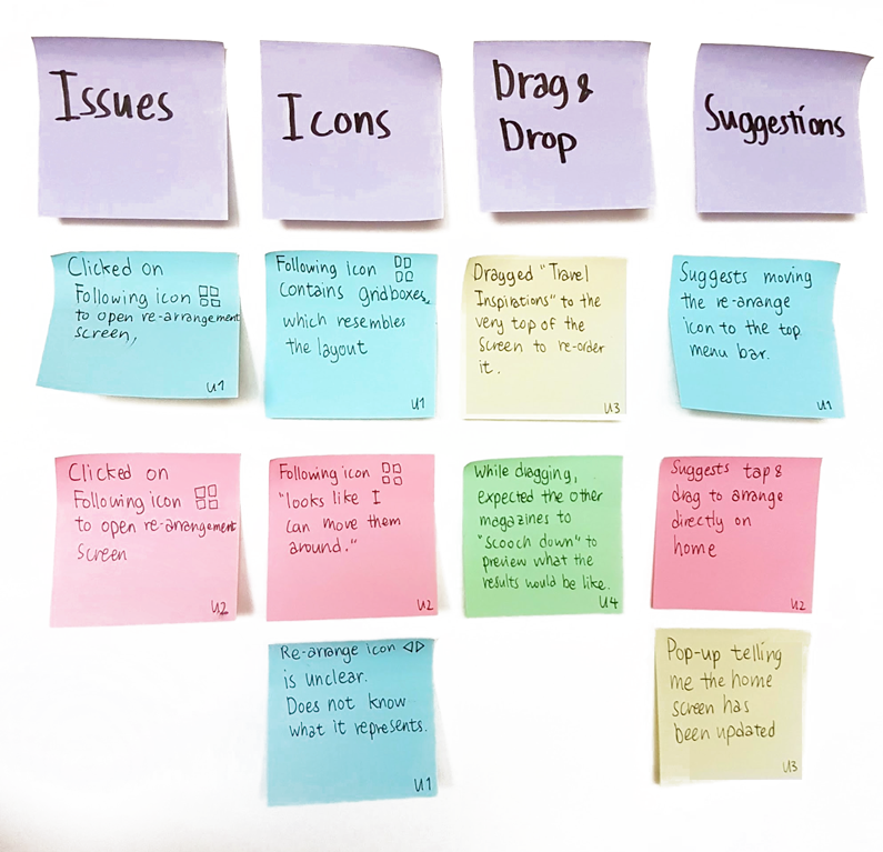
Here are some of the issues and feedback I got from 4 user testing sessions:
Interface Revisions
From the test results and feedback, I made some revisions to the design.
1. Changed the re-arrangement button to a more understandable icon and moving it to the top menu for easier discovery
One of the biggest issues from the testing is being unable to find the button to open the re-arrangement screen. One of the test participants clicked on the Following icon because "they look like grids that can be dragged around." Another participant expected the button to be at the top along with the other menus.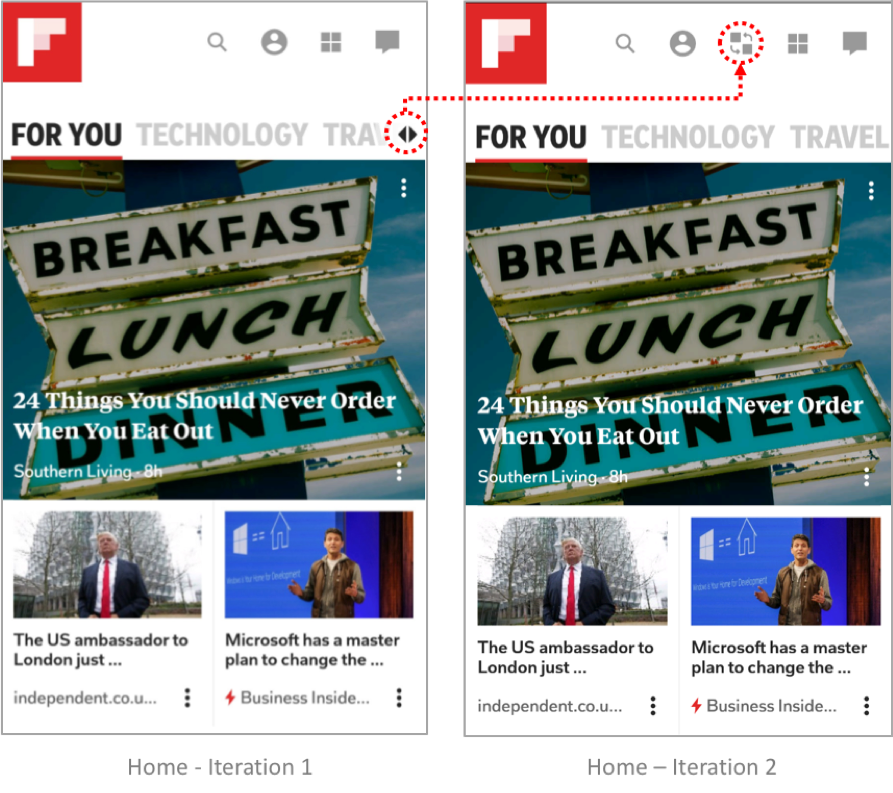
2. Instead of waiting for the user to complete the drag & drop, the re-arrangement occurs on hover to give users a preview of what the new arrangement would look like
When asked to re-arrange a magazine to the top, one of the participants dragged it all the way to the very top of the screen and waited a while before dropping. Another participant doubted whether she was re-arranging it right, because the other magazines weren't "scooching down".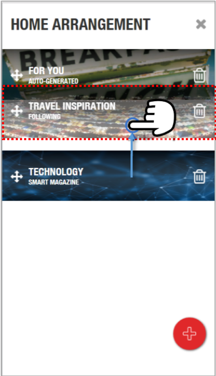
3. Added a pop-up to notify that the home screen has been updated
After clicking on "OK" and completing the task, many of the test partipants were not sure if they were "done." The lack of confirmation requires the participants to check the new order of the magazines themselves.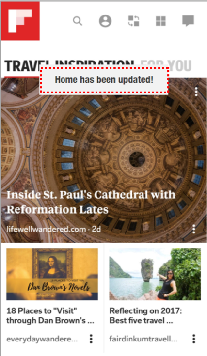
Evaluation
After revising my prototype, I approached a few more peers to do more testing and evaluate the design. I have extracted some of their quotes regarding the design for tasks below :
Adding a new magazine to home
“The design is very straight-forward, it works just as I expected it to.”
“I like how the magazine became colored when I selected it.”
“The re-arrange icon is a lot clearer. Looks like I can scramble it around.”
Removing & ordering the magazines.
“I like how the other magazines moves up and down when I drag.”
“Deleting is easy, I can just click on the trash can.”
“The update notification is a nice touch.”
Reflection
This has been a very difficult project to start off with, since the app itself is already very well designed. I had ideas in my head which I initially had no idea how to prototype. This project has forced me to step out of my comfort zone — and the new skills I’ve learned is definitely rewarding. Here are some lessons I learned: