
Overview
Based on 15 usability testing sessions conducted in April 2017, our team has identified 5 most critical usability issues, provided a corresponding list of recommendations, as well as insights (likes, dislikes, and suggestions) from our participants.
Project Goals
- Identify potential usability and design problems in the current app.
- Analyze the issues to determine the causes.
- Provide recommendations for improving the usability of the app.
Methodology
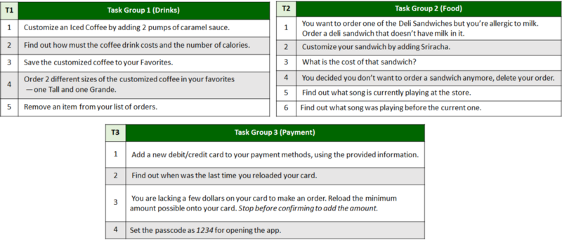
Task List
In order to evaluate many of the app’s vast functions while keeping the sessions short, we created 3 sets of tasks — each with a different focus. These were all programmed in Qualtrics, which automatically assigned participants to one of the three task groups.
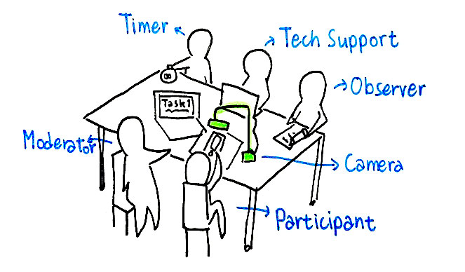
Session & Roles
To keep the conditions of our tests as natural as possible, we recruited participants and tested at a Starbucks Store. Each team member concentrated on a single role.
- Tech support: Start & stop recording the camera
- Timer: Notes down time taken for each task, prepares device/resets app
- Observer: Write down observations, main-note taker
- Moderator: Runs the session, communicate with the participant
Results
Task Completion Success Rate
Tasks with highest %Incomplete includes finding the cost, finding the last amount of money reloaded, and adding the minimum amount.
Average Time on Task
Participants spent the most time adding a credit card and adding money to the card.
Net Promoter Score (NPS)
With a score of -29%, participants are not likely to recommend the Starbucks app to a family member or friend.
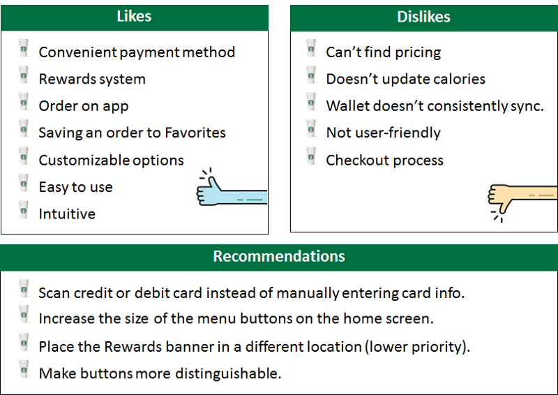
Survey Results
Participants likes the convenience of the app, but dislikes the complicated check-out process.
Usability Issues
From the results of our observations and surveys, we consolidated a list of usability issues and then evaluated them based on a severity rating scale of 0 to 5 (0 being not a problem, 5 being a usability crisis).
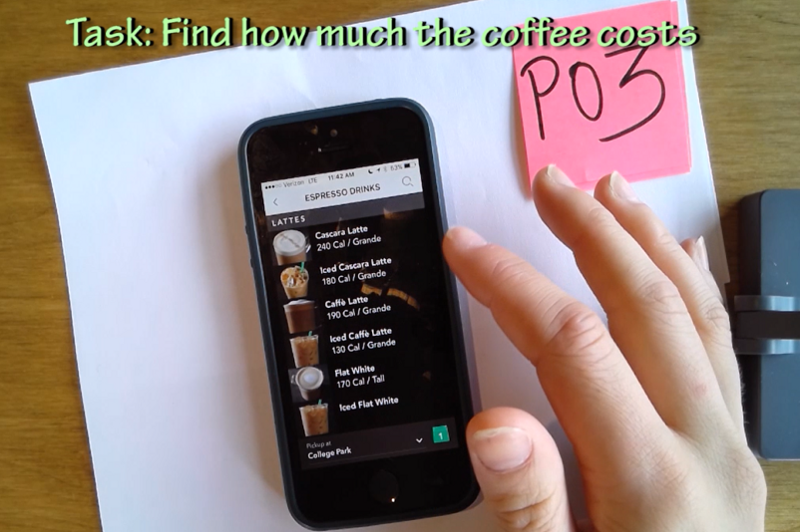
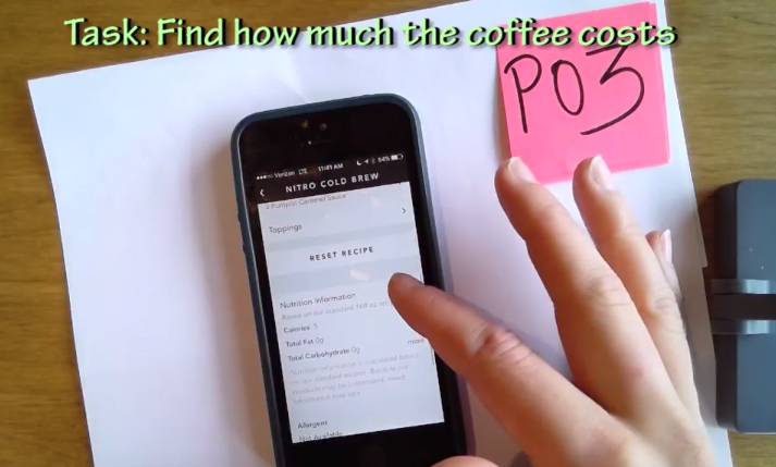
1. Finding the price of an item (Rating 5)
The price is shown only after a user have gone through to the checkout section. Many users have expected the price to be shown earlier while they were selecting their items.
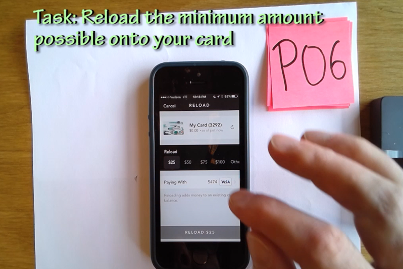
2. Minimum amount to reload is hidden (Rating 4)
After clicking on the drop-down list to select the reload amount, the users are shown options ranging from $25 to $100, with an additional “Other” option. Clicking on “Other” would reveal that the actual minimum amount to reload is $10.
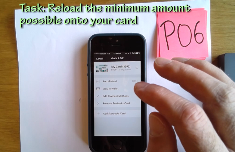
3. “Add Payment Methods” is not clearly visible (Rating 4)
After clicking on the “Manage” in the payment section, users have the option to “Edit Payment Methods” or “Add Starbucks Card”. Since the user wanted to add a credit card, the second option seems very promising.
4. Misleading calories after drink customization (Rating 3)
Users did not realize that the calories were not updated and was no longer valid after their customization.
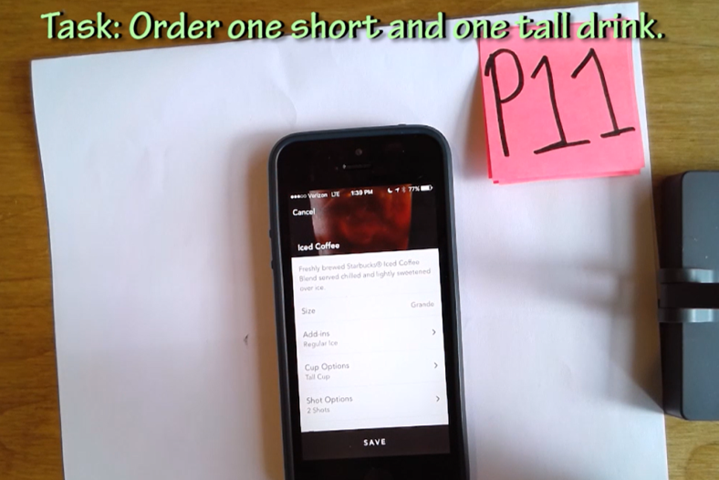
5. Cup size is confusing (Rating 2)
Users may select the size of the cup for the drink to be served in, which is different from the actual drink size. One of our users misunderstood the cup size for the size of the drink.
Recommendations
Lastly, we provide suggestions for making changes to the app on a scale of 0 to 5 (0 being nice to have, 5 being strongly suggested).
1. Add each item’s price to the menu (Rating 5)
Participants had difficulty finding the price and expect them to be listed on the menu. Providing this information beforehand avoids the trouble of having to select the store and go through to the checkout process.
2. Make the minimum amount to be reloaded clearly visible in the options (Rating 4)
For a more logical understanding, the first options shown should start with the smallest amount then incrementally increase with a “More” option for higher values. For example the options should be $10, $15, $20, $25, $30, More.
3. Add a “Add Payment Methods” option (Rating 4)
Instead of requiring the users to go inside the “Edit Payment Methods” section to add a credit card, there should be an additional “Add Payment Methods” option clearly visible at the same menu level with “Add Starbucks Card”.
4. Update nutrition facts to reflect drink customization (Rating 2)
The application can implement additional features to calculate new nutrition facts based on the user’s customization. Alternatively, a note saying that the calories does not account to customization can be added to the top of the nutrition list if this change are not to be implemented.
5. Change the terminology for “Cup options” (Rating 2)
“Size” and “Cup options” can be easily misunderstood, hence the cup size option should use a less ambiguous terminology, such as “Container size”.
Reflection
While we are aware that several of the identified issues may have been a result of stakeholder’s decisions, our team has evaluated the studies based on actual observations with real users with the goal to report these findings as accurately as possible. Our team have gained an articulate amount of experience in performing hands-on usability testing, recruiting participants in a real environment, and drawing conclusions from our records and observations. We hope this study would bring useful insights for future enhancements.
1. Find a balance between the business goals and user goals
This is crucial to the design of a successful application.
2. The document camera drew our participants interest and evokes professionalism.
This was extremely helpful in our recruiting process, especially with the lack of tangible incentives.